For trophy shops and award providers, custom medals represent your highest-value orders—and your greatest potential for costly errors. A flawless custom medal delights clients and builds your reputation. A single mistake in artwork, color, or text can lead to remanufacturing, missed deadlines, and unhappy customers.
The difference between success and a stressful mistake often lies in the artwork submission and approval process. A clear, professional workflow protects your business, educates your clients, and ensures the final product exceeds expectations.
At 365medal.com, we’ve processed thousands of custom orders and have seen how the right practices make all the difference. This guide provides a step-by-step framework for managing custom medal artwork and approvals with confidence.
Phase 1: The Foundation – Guiding Client Artwork Submission
The process starts the moment a client says, “We have our own design.” Your guidance here is critical to receiving usable files.
1. Communicate Clear Artwork Specifications Upfront
Don’t wait for the client to send the wrong file. Provide clear, written specs in your quote or a dedicated design guide. Include:
- Preferred File Formats: Vector files are king. Specifically request:
-
- .AI (Adobe Illustrator)
- .EPS (Encapsulated PostScript)
- .PDF with embedded vector data
- Note: .SVG can be acceptable but may require cleanup.
- Raster/Image Requirements (if vectors are unavailable):
-
- Resolution: Minimum 300 DPI (Dots Per Inch) at the final medal size.
- Format: .PSD (layered), .TIFF, or high-quality .PNG.
- Size: The image dimensions should be at least the actual size of the medal (e.g., 3 inches wide).
- Critical Rules:
-
- Convert All Text to Outlines/Paths. This prevents font substitution issues if your system doesn’t have their font.
- Define Color Spaces. Specify that colors should be in Pantone (PMS) for spot color accuracy, or provide CMYK values for full-color process printing.
- Include Bleed & Safe Zones. If the design goes to the edge, request a 1-2mm bleed area. Mark critical text/elements that must stay within a safe zone.
2. Provide a Template (Your Secret Weapon)
Create and offer a simple downloadable template. This is a game-changer.
- What to include: A basic outline of your standard medal shapes (round, custom, etc.) with clear layers for:
- Artwork Boundaries
- Safe Zone Guidelines
- Sample Text Layer (with instructions to outline fonts)
- Why it works: It gives clients a visual framework, drastically reducing off-center or incorrectly scaled submissions
3. Initiate a “Design Discovery” Conversation
Ask key questions before they send anything:
- “Do you have a vector logo, or just a JPEG from your website?”
- “Are the colors you see critical? Do you have Pantone numbers?”
- “Is there any extremely fine text or detail we should be aware of?”
This sets expectations and flags potential issues early.
Phase 2: The Review & Proof – Creating a Clear Approval Roadmap
Once you receive the artwork, your internal review and proof creation are the last line of defense before production.
4. Conduct an Internal Technical Review
Before sending anything to the client, check the file yourself or with your manufacturer:
- Open the vector file. Verify layers, outlined text, and stray points.
- Check color swatches. Confirm they are Pantone, not RGB.
- Measure line weights. Are they too thin to stamp or etch cleanly?
- Look for complexity issues. Will the detail be lost when reduced to medal size?
Pro Tip from 365medal.com: Send questionable files to your manufacturing partner for a free pre-check. We often identify issues shops can miss, saving everyone time.
5. Create an Unambiguous, Annotated Digital Proof
The proof is your contract. It must be crystal clear.
- What a Great Proof Includes:
- A realistic 2D or 3D rendering of the medal.
- Clear callouts for colors (with PMS numbers listed).
- Exact text spelling and typography.
- Dimensions (diameter, thickness).
- Annotations for any potential concerns: e.g., “Fine detail in area A may soften slightly in production.”
- A unique Proof ID number and revision date.
- What to Avoid: Never send a raw AI file as a “proof.” Always send a flattened, annotated PDF or JPEG marked “FOR APPROVAL ONLY.“
Visual Example of a Good Proof Annotation:
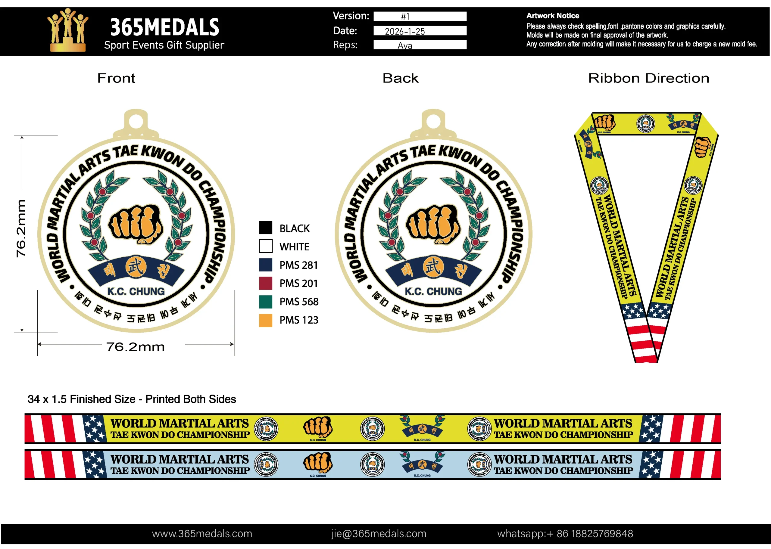
- Version/Date/Reps: unique introduction for this proof,if there is revise requirement, change version to #2 #3 .. ; change date to that day. when confirm, provide the version number and date information to avoid misunderstanding.
- Artwork notice: always reminding clients to pay attentions to PMS number, Spelling, Fonts and details carefully.
- Graphic design: size, color with pms number, front back side design, ribbon design and direction view.
- Contact information: your company information and contact information, clients will easy to contact you when they want to do revise.
6. Mandate Formal, Documented Approval
Make the approval process official.
- Method: Use a system that requires a digital signature or a reply-all email with explicit approval (“I approve this proof as shown”).
- Policy: State clearly: “Production cannot begin without written approval. Any changes after approval will incur revision fees and delay the schedule.”
- Send a final “Approval Summary” email that recaps the approved proof ID, date, and project details. This is your legal backup.
Phase 3: Avoiding Common & Costly Errors
Most errors are preventable. Watch for these top pitfalls:
- The “Website Logo” Trap: A client sends a 72 DPI, RGB logo from their website header. It looks blocky and pixelated when enlarged.
- Solution: Politely explain why it won’t work and ask for the original vector file from their designer or marketing department.
- The “Last-Minute Text Change”: After approval, the client emails, “Actually, can we change ‘5th Annual’ to ‘6th Annual’?”
- Solution: Refer to your approval policy. Stop production if possible, and clearly communicate any fees and new deadlines. Get re-approval.
- The Color Assumption Error: The client says “use our blue,” but the proof shows PMS 293 and they were thinking of PMS 287.
- Solution: Always specify Pantone numbers on the proof. For non-branded items, provide a physical Pantone swatch book or a calibrated digital color reference.
- The “Missing the Markup” Mistake: A client approves a proof but misses a tiny annotation about a compromise on detail.
- Solution: Use high-contrast, obvious callouts. Verbally highlight any potential compromises when you send the proof.
Conclusion: A Smooth Process is Your Competitive Advantage
A disciplined artwork and approval process does more than prevent errors—it builds immense client trust. It shows professionalism, manages expectations, and turns a complex service into a smooth, collaborative experience.
By providing clear guidelines, using annotated proofs, and requiring formal sign-off, you protect your margins, your timeline, and your reputation. You position your shop as the expert who seamlessly translates a client’s vision into a tangible, perfect award.
Let 365medal.com Be Your Back-End Partner. Our expertise lies in turning approved artwork into stunning reality. We provide clear pre-checks, detailed factory proofs, and expert guidance on manufacturability.
Ready to streamline your custom order process and eliminate artwork errors? Download our free Artwork Submission Checklist or contact our design team for a consultation on your next complex project.


